New blog post and sneak peek of design refresh
Posted by Megan Otis on Friday, October 13, 2017 at 3:53 PM PDT
Happy Friday the 13th Content Editors:
I’ve got a few pieces of website news to share with you.
Blog post on new features in TerminalFour version 8.2.1
As promised in my last message, I have written up a blog post with screen shots showing some of the changes you will see in the site manager now that we’ve upgraded to T4 version 8.2.1. I point out some of the new interface changes that make navigating easier to manage, another feature to help you catch broken links, easier creation of accessible tables, and some new options for your forms in Form Builder.
Design refresh update: Sneak peek
The timeframe for rolling out the design refresh and template changes will be several more weeks, but in the meantime here are a few more details about the design refresh we’re excited to share with you all:
- Overall cleaner look with fewer grey borders and more white space
- Website background color will be changing from light grey to white
- Font size and line height (space between lines) will be increasing 15-25% (depending on the content type)
- Yellow page titles will be replaced by red page titles (hooray!)
- The Jumbotron and Quicklinks content types will be redesigned with brighter brand colors and a cleaner look (goodbye black and yellow flags!)
- More options for content type placement. Some content types are currently limited to just one zone, but after the roll out, more content types will be available in more zones. For example, the infographic content type (which is currently only available in zone A) will be offered in all zones on the page.
- New styles for all banners
- Launching several new content types, among which include the Panel, and the Spotlight, which we’re excited to show you a sneak peek of the designs:
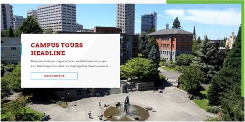
Panel

- A text box overlaid on top of an image with a partial colored border. Size and placement of the text box will be variable. This content type will be great for sprucing up the look of your page with the addition of a large graphic element.
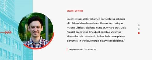
Spotlight

- A small circular image next to a quote or testimonial, with different options for background colors. This content type will be great for highlighting faculty, student or alumni successes.
Thank you for bearing with us while we prepare these exciting new changes for our Seattle U websites.
As always, content editors, thank you for your hard work keeping our websites up to date and looking great.
Best wishes,
Jason Beardriel and Megan Otis
