Accessibility
Creating accessible content is about making sure that all users can access and navigate your web content — including, and especially, users with disabilities.
Beyond providing a good user experience for all users, Seattle U is required by law to meet minimum accessibility standards; in practice, we strive to meet WCAG 2.1 AA standards.
As content editors of Seattle U's websites, there are several things you should do to increase the accessibility of your websites:
- Use plain language
- Use proper heading structure
- Include text alternatives
- Post accessible files
- Use links appropriately
- Use tables appropriately
- Mindful use of color and contrast
Download the PowerPoint slides on Web Accessibility used in the video above. This PPT presentation was also presented at the Fall 2018 Web Forum on Website Accessibility on October 31, and November 8, 2018. The same content shown in the video, and in the PPT, are also covered below.
Use Plain Language
Writing clearly and simply is one of the most important things you can to do increase the accessibility of your web content.
"... the understandability of web content depends upon clear and simple writing. Unclear or confusing writing is an accessibility barrier to all readers, but can be especially difficult for people with reading disorders or cognitive disabilities."
— WebAIM: Writing Clearly and Simply
The concept of readability does depend greatly on the audience. As a university website, our audiences -- even the youngest prospective students -- generally speaking have a higher reading level than the general population. However, there are people with disabilities even among the most highly educated users, so there are always changes we can make to our content to make it more readable.
- Write as concisely as possible. Write short sentences and paragraphs.
- Replace complex words with simpler ones.
- Check your spelling and grammar. See our blog post on misspellings.
- Minimize the use of jargon, acronyms, abbreviations. If they are necessary, then make sure to provide definitions.
Also, see our recommendations in Web Content Guidelines and Writing for the Web.
Use Proper Heading Structure
Organize your content into a structure using headings that convey a meaningful hierarchy.
Pages should be divided into parts labeled by headings. Organizing your content using headings and subheadings will allow all of your users (especially those using assistive technologies, like screen readers) to quickly and easily find the specific topics they are looking for on your web page.
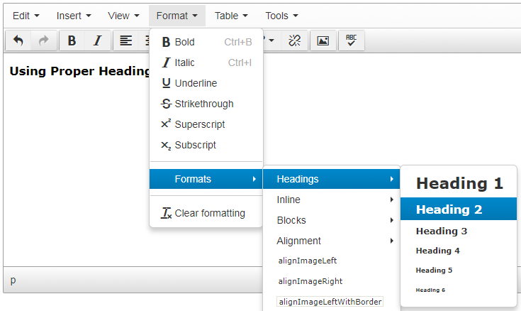
Headings should be marked up using proper HTML headings so that users can easily understand and navigate your website content. Seattle U content editors can use the Text Editor in TerminalFour to add proper heading structure by clicking Format > Formats > Headings and then selecting Heading 1 through Heading 6.

- If it looks like a heading, be sure to mark it up as a heading (don't just bold or italicize it).
- Don't skip levels. Don't use an H3 heading if you haven't used an H2 heading yet.
- The page title (whether it shows on your page layout or not) counts as the H1 heading.
- Don't select a heading just because you like the way it looks on the page.
- Don't mark a full sentence up as a heading just because you want it to appear in large, red text to draw attention to it on the page. This makes it more difficult for users with disabilities, especially users using screen readers, to fully understand the content on the page.
Include Text Alternatives
When you use images or multimedia to convey important content to your users, it is important to include text alternatives that are accessible to users using assistive technologies.
'Alt' Description for Images
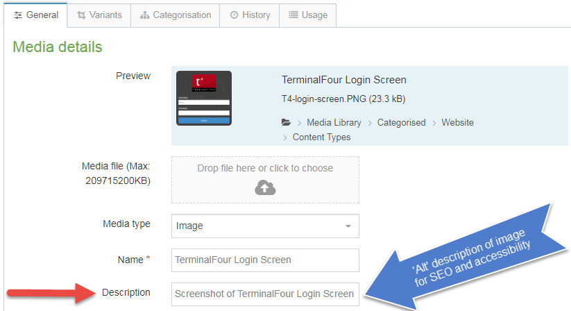
Every image should have a short, concise 'alt' description; this description is read aloud to users by the screen reader and should convey the meaning of the image to someone who cannot see it (or see it well).
- 'Alt' descriptions should be less than 125 characters (less than the length of a Tweet).
When you upload images to the Media Library, you should add an 'alt' description in the 'Description' field.

Avoid using images that include a lot of text on them. If the text is too long to put it in the 'alt' description, consider putting the text directly on the page instead of in an image.
If you decide to use a text-heavy image on your page, you must provide an accessible alternative.
- If it's short, add the text that appears in the image to the 'alt' description field.
- Use an accessible, relevant content type, such as Infographic.
- Post an accessible PDF version.
Provide Transcripts or Captions for Video or Audio Content
When using video or content, it is important to provide a transcript, captions or subtitles for users who cannot hear or hear well.
In TerminalFour, we provide which enable content editors to easily embed a YouTube or Vimeo video into your Seattle U websites.
- See MarCom's Guidelines and Best Practices for Video Captioning
- See Vimeo's instructions for adding captions and subtitles to your Vimeo videos.
- Vimeo allows you to upload a previously created caption file (such as .srt or .vtt format) to a video.
- Otherwise, Vimeo will refer you to a paid third-party service.
- YouTube has several features that make it easier for users to create/edit captions including transcribe and auto sync, and automatic captioning. See YouTube's instructions for adding your own subtitles and closed captions to your YouTube videos.
- Seattle U students and faculty can also use the video management system Studio (formerly Arc), which is integrated into Canvas, to generate captions for their video content. Videos uploaded to Studio/Canvas are automatically closed captioned, then you can review and edit the captions for accuracy.
- Because of the high chance of error, automatic captioning does not meet legal standards. If you use automatic captioning in YouTube or Studio, you must review the captions for accuracy and correct any inaccuracies.
Post Accessible Files
When you are posting a link to a Word document or PDF on your Seattle U website, you'll want to make sure that your files are accessible before you upload them to the Media Library.
Siteimprove Resources on Accessible Documents
These resources require a Siteimprove account. If you do not already have a Siteimprove account, please contact the MarCom Web Team for access.
- Siteimprove Help Center: Webinar: Making PDFs Accessible
- Siteimprove Academy: Accessibility for Microsoft Office
Accessible Microsoft Office Documents
- Microsoft's Rules for the Accessibility Checker
- Microsoft's Make your Word documents accessible to people with disabilities
- Microsoft's Make your PowerPoint presentations accessible to people with disabilities
- Microsoft's Make our Excel documents accessible to people with disabilities
Accessible Adobe PDFs
- WebAIM's PDF Accessibility
- Adobe's instructions on creating and verifying PDF accessibility
- Microsoft's Create accessible PDF's from a Microsoft Office document
Use Links Appropriately
Firstly, you should make sure that links are working properly. See our blog post on for more information.
Next, link text should make sense out of context and should give users an idea of where they will go when they click on the link. (So link text like 'click here' are uninformative and especially unhelpful for users using assistive devices).
Link text should be short; try not to use the entire URL for the link text, especially if it's lengthy and not human-readable (screen readers read the entire link text out loud).
Also, links should be the only text on a page that are underlined.
If you are using an image as a link, the image's 'alt' description should contain the description of where it will take users if they follow the link.
Use Tables Appropriately
Tables on websites should be used to present tabular data only, and not to control the layout of your page.
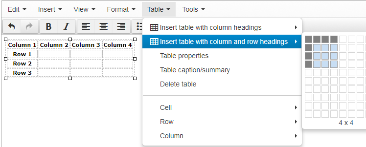
If you need to present tabular data, then it's important for tables to be appropriately formatted in the HTML so that users can successfully navigate and derive meaning from the tables on your website.
But you don't have to know HTML in order to create accessible tables in TerminalFour.
Column and Row Headings

Table caption and summary
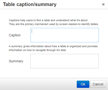
Another strategy for making your tables more accessible is to add a caption and/or a summary. Table captions and table summaries are "metadata" which means that the information is not typically displayed on the page, but is added to the code "behind the scenes" but it is read aloud to users using a screen reader to provide context and other helpful information to derive meaning from the table. You can now easily add a table caption or summary by selecting Tables > Table caption/summary.

Mindful Use of Color and Contrast
Some users (such as those with color blindness or contrast sensitivity) cannot easily distinguish between different colors, therefore you must be very mindful of how you use color and contrast on your website.
Try to stick with the color options that are built into the content types. The MarCom Web Team builds content types to meet accessibility standards.
Don't rely on color alone to convey meaning, direct navigation or differentiate between items.
Ensure you have sufficient contrast between the color of the text and the color of the background.
If you're not sure whether you have sufficient contrast to meet accessibility standards, use the guidelines provided by MarCom about SU brand color contrast for web accessibility or find out using a third-party resource such as the WebAIM Color Contrast Checker.
Other Recommendations for Accessibility
- Type text into T4 in sentence case
- Unless it's a short acronym, do not type your content into T4 in all caps as some screen readers will read the letters individually
- Avoid flashing, flickering, blinking, or otherwise animated images
- These can sometimes trigger seizures in some users
- Make sure your carousel allows enough time for users to the read the text on each slide
- If you're embedding a form or widget from a third-party site, it must be accessible, or you must provide an accessible alternative.
- If you are a member of the code-users permissions group, and you are adding your own HTML, CSS, or JavaScript to your Seattle U website, you are responsible for ensuring that the code meets accessibility standards.
Conclusion and Other Resources on Web Accessibility
- Try to increase your understanding of the experiences of people with different types of disabilities. Use a screen reader to listen to your website. Or check out some user story videos from W3C.
- Request access to Siteimprove
- Siteimprove is an easy way to find and fix accessibility issues (and other website quality issues)
- Siteimprove has free training courses, videos, and interactive modules
- Email the MarCom Web Team to get access to Siteimprove
As always, if you have any questions about what you can do to make your web content more accessible, feel free to check out the resources below and contact the MarCom Web Team for assistance.
- Accessibility Basics from Usability.gov
- Easy Checks - A First Review of Web Accessibility from W3C Web Accessibility Initiative
- Principles of Accessible Design from WebAIM: Introduction to Web Accessibility
- How to Meet WCAG 2.1 from W3C Web Accessibility Initiative
- W3C Accessibility Principles
- WCAG 2.1
- Create Accessible Video, Audio and Social Media (Section508.gov)
Social Media Accessibility
In addition to making your Seattle U websites accessible, there are also things you can do to make your Seattle U social media accessible as well. Check out the below resources for more information.