Call to Action Feature
Description
You can easily call for your users' attention and persuade them to act by using a "Call to Action Feature" content type.
This content type creates a colorful and eye catching content block with up to four call-to-action buttons, an optional large heading, on top of a background image with a color overlay.
Available in zones:
- Zone A
- Zone B
- Zone C
Permissions:
- Available to all content editors
How to use it
Navigate to the section where you wish to add this content item. Click "Create content" then select the "Call to Action Feature" content type.

Required fields
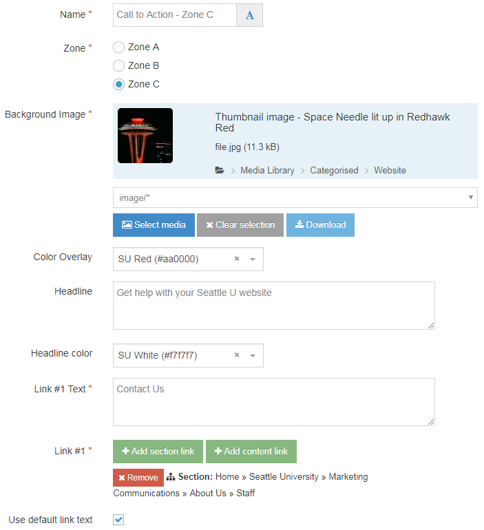
- Name
- The text in this field is for internal, informational purposes only, and appears in the list of 'content in this section.'
- Zone
- This field is a radio button which allows you to select what location on the page this content block should appear: Zone A, B, or C.
- Background Image
- In this field you will select an image from the Media Library to serve as the background image for this content block.
- Make sure your image is optimized for the web before adding it to the Media Library.
- Link #1 Text
- The text in this field will become the text displayed in the first call to action button. You'll want the call to action to be short yet compel your users to perform a specific action, such as "apply now," "request information," "contact us," etc.
- Link #1
- This field you will select a section link or content link to link your users to another page or specific content block housed within TerminalFour.
Optional fields
- Color Overlay
- This field is a drop down menu which allows you to select one of 11 SU brand colors:
- SU Black (#333333)
- SU Brown (#807060)
- SU Dark Blue (#003282)
- SU Dark Green (#124a12)
- SU Emerald (#008765)
- SU Gold (#fdb913)
- SU Green (#55b31b)
- SU Light Blue (#04a9c5)
- SU Orange (#ef4135)
- SU Red (#aa0000)
- SU White (#f7f7f7)
- This field is a drop down menu which allows you to select one of 11 SU brand colors:
- Headline
- What's written in this field becomes the optional large headline above the call to action buttons.
- The headline appears in uppercase lettering and has a slight black text shadow around the letters in order for the headline to stand out more clearly from the background image.
- Headline Color
- This field is a drop down menu which allows you to select one of 11 SU brand colors for the headline:
- SU Black (#333333)
- SU Brown (#807060)
- SU Dark Blue (#003282)
- SU Dark Green (#124a12)
- SU Emerald (#008765)
- SU Gold (#fdb913)
- SU Green (#55b31b)
- SU Light Blue (#04a9c5)
- SU Orange (#ef4135)
- SU Red (#aa0000)
- SU White (#f7f7f7)
- This field is a drop down menu which allows you to select one of 11 SU brand colors for the headline:
- Link #2 Text
- Link #2
- Link #3 Text
- Link #3
- Link #4 Text
- Link #4
Additional Things to Consider
Accessibility
You need to be sure your content is as accessible to all users as possible.
Though we offer you a choice of headline colors, not every text color will work well with every background image and color overlay.
Keep in mind you also want provide as much contrast as possible between background and text color for readability and accessibility purposes.
- Find out if your choice of background and text color meet accessibility standards with the WebAIM Color Contrast Checker.
Permission and Copyright Law
When selecting a background image ask yourself these questions: Did you create this image? Is the image copyright protected? Do you have permission to use this image?
All web content must comply with the Seattle University Copyright Guidelines. Text, images and videos, and other media files, that do not meet these requirements must be deleted immediately.
In cases where copyrighted material is posted with the permission of the content owner, that permission must be attained in writing and be available for verification if needed.