Dual Column Content
Right column of dual column content
Here are some bullets to help make this look cooler:
- Bullet 1
- Bullet 2
- Bullet 3
- Bullet 4
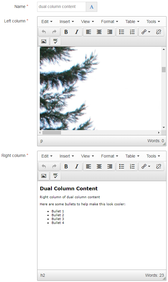
The "Dual Column Content" content type will display your Zone A content in two equal-width columns. You can see an example further down on this page, as well as several other examples elsewhere on the Seattle U website listed below.
If you are ever tempted to use a table in order to control the layout of your page and put your content into two separate columns (which is not good practice) then you should use the "Dual Column Content" content type instead.
Navigate to the section where you wish to add the dual column content item. Click "Create content" then select the "Dual Column Content" content type.

There are only three required fields in this content type:
This content type is responsive, which means that it changes size based on the width of the browser or screen that is displaying it.
The two columns will be side-by-side only when users view the page on a wide screen (768 pixels or more).
On a browser or device less than 767 pixels (like a mobile device), the columns become stacked on top of each other so that the content in left column content is on top, and the right column is on bottom.
So keep this in mind when you are planning what content goes in which column.

Right column of dual column content
Here are some bullets to help make this look cooler: