Image Panel
Description
Draw attention to a block of content and add visual interest to your page with an Image Panel content type.
The Image Panel includes a large background image, with a smaller text box overlaid on top of the image. The text box can include a title, small amount of paragraph text, and up to 2 button links.
Best practice for image panels: we recommend that this content type is only used in a 1 or 2 column page layout (such as a standard subpage or landing page layout with no Zone B content, or Home page layout with or without Zone B content).
Available in zones:
- Zone A
Permissions:
- Available to all content editors
How to use it
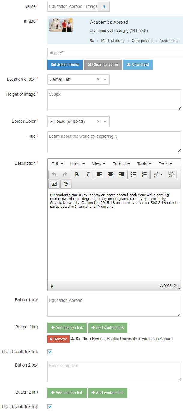
Navigate to the section where you wish to add the content item. Click "Create content" then select the "Image Panel" content type.

Required Fields
- Name
- The text in this field is for internal, informational purposes only, and appears in the list of 'content in this section.'
- Image
- In this field you will select an image from the Media Library to serve as the background image for this content block.
- Make sure your image is optimized for the web before adding it to the Media Library.
- Location of Text
- In this field you can customize the placement of the textbox on top of the background image by selecting one of the following placement options:
- Bottom Center
- Bottom Left
- Bottom Right
- Center Center
- Center Left
- Center Right
- Top Center
- Top Left
- Top Right
- In this field you can customize the placement of the textbox on top of the background image by selecting one of the following placement options:
- Height of image
- Enter the maximum height you want for your image in pixels (make sure to add "px" at the end)
- Border color
- This field is a drop down menu which allows you to select one of 11 SU brand colors:
- SU Black (#333333)
- SU Brown (#807060)
- SU Dark Blue (#003282)
- SU Dark Green (#124a12)
- SU Emerald (#008765)
- SU Gold (#fdb913)
- SU Green (#55b31b)
- SU Light Blue (#04a9c5)
- SU Orange (#ef4135)
- SU Red (#aa0000)
- SU White (#f7f7f7)
- This field is a drop down menu which allows you to select one of 11 SU brand colors:
- Title
- The text in this field is the heading in your Image Panel
- Description
- The text in this field is the short description text beneath the heading in the image panel.
Optional Fields
- Button 1 text
- The text in this field will become the text displayed in the first button
- Button 1 link
- Add a section link or content link for this button
- Button 2 text
- The text in this field will become the text displayed in the second button
- Button 2 link
- Add a section link or content link for this button
Additional things to consider
Responsive design
When your users view your image panel at mobile sizes (767px or smaller), the text box will appear above the image, rather than on top of the image.
Selecting a good image
- Test in preview to make sure your image panel looks good at both mobile sizes and desktop sizes
- Optimize your image for the web to increase load speed
- Select or crop the image so that it has some negative space where the text box can be placed without obscuring the focal point of the image
Permission and Copyright law
Did you create these images? Are these images copyright protected? Do you have permission to use these images?
All web content must comply with the Seattle University Copyright Policy. Text, images and videos, and other media files, that do not meet these requirements must be deleted immediately.
In cases where copyrighted material is posted with the permission of the content owner, that permission must be attained in writing and be available for verification if needed.
Accessibility
You need to be sure your content is as accessible to all users as possible.
If your images are providing important content to your users, then you need to include a description of the image that will convey the meaning of the image to users who cannot see or see well and are using a screen reader to navigate your website. You should include any text that appears on the image in the description.
When you upload your images into the Media Library, the text you add in the "Description" field will be read to users by the screen reader. Make sure the description is short but conveys the meaning of the image.
Examples
Learn about the world by exploring it
SU students can study, serve, or intern abroad each year while earning credit toward their degrees, many on programs directly sponsored by Seattle University. During the 2015-16 academic year, over 500 SU students participated in International Programs.