Mini Spotlight
Description
Between one and four mini spotlights: each mini-spotlight includes a small circular image, heading with an optional link, and a short paragraph of text.
Available in zones:
- Zone A
- Zone B
- Zone C
Permissions:
- Available to all content editors
How to use it
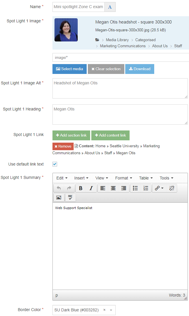
Navigate to the section where you wish to add this content item. Click "Create content" then select the "Mini Spotlight" content type.

Required fields
- Name
- The text in this field is for internal, informational purposes only, and appears in the list of 'content in this section.'
- Spot Light 1 Image
- In this field, you will select an image from the Media Library to serve as the image for the first mini-spotlight.
- All mini-spotlight images should be square, and the exact same size for consistency: something between 150x150 to 200x200 pixels is recommended.
- Spot Light 1 Image Alt
- Spot Light 1 Heading
- The text in this field becomes the red heading beneath the first image.
- Spot Light 1 Summary
- The text in this field becomes the short description or summary beneath the first heading.
- Border Color
- This field is a drop-down menu which allows you to select one of 11 SU brand colors.
- Zone Option
- This field is a radio button which allows you to select what location on the page this content block should appear: Zone A, B, or C.
Optional fields
- Spot Light 1 Link
- You can turn the mini-spotlight "headings" into a link to another page or content item, by adding a section or content link in the link fields.
- Spot Light 2 Image
- In this field, you will select an image from the Media Library to serve as the image for the second mini-spotlight item.
- All mini-spotlight images should be square, and the exact same size for consistency: something between 150x150 to 200x200 pixels is recommended.
- Spot Light 2 Image Alt
- Spot Light 2 Heading
- The text in this field becomes the red heading beneath the second image.
- Spot Light 2 Summary
- The text in this field becomes the short description or summary beneath the second heading.
- Spot Light 2 Link
- Add Spot Light 3
- If you wish to add a third mini-spotlight, check the 'yes' box.
- Spot Light 3 Image
- Spot Light 3 Image Alt
- Spot Light 3 Heading
- Spot Light 3 Link
- Spot Light 3 Summary
- Add Spot Light 4
- If you wish to add a fourth mini-spotlight, check the 'yes' box.
- Spot Light 4 Image
- Spot Light 4 Image Alt
- Spot Light 4 Heading
- Spot Light 4 Link
- Spot Light 4 Summary
Additional things to consider
Permission and Copyright law
Did you create these images? Are these images copyright protected? Do you have permission to use these images?
All web content must comply with the Seattle University Copyright Policy. Text, images and videos, and other media files, that do not meet these requirements must be deleted immediately.
In cases where copyrighted material is posted with the permission of the content owner, that permission must be attained in writing and be available for verification if needed.
Accessibility
In order to ensure your content is as accessible to all users as possible, the mini-spotlight content item allows you to add an 'alt' description for each spotlight image within the content item (instead of in the Media Library).
Image 'alt' descriptions should convey the meaning of the image to users who cannot see or see well and are using a screen reader to navigate your website.
Megan Otis
Web Support Specialist
Aubrey Benasa
Digital Designer
Anne Reinisch
Graphic Designer
Victor Chimenti
Web Application Developer
Megan Otis
Web Support Specialist


