Spotlight
Description
The Spotlight content type features a large circular headshot photograph next to a quotation and attribution, with a customizable partial background image or background color and design accents (including a tree arrow pointing to the left side of the image, a partial border around the image, and a left border next to the name of the source and affiliation).
This content type is a more visually impactful alternative to the testimonial or quote content types.
Available in zones:
- Zone A
Permissions:
- Available to all content editors
When to use it
If you wish to share a success story, or showcase the experiences of current students, alumni, or faculty, for example, then the Spotlight content type could be a great tool.
How to use it
Navigate to the section where you wish to add this content item. Click "Create content" then select the "Spotlight" content type.

Required fields
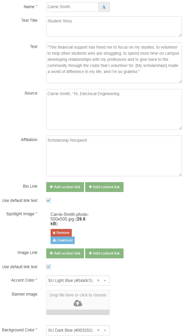
- Name
- The text in this field is for internal, informational purposes only, and appears in the list of 'content in this section.'
- Spotlight Image
- In this field you will select an image from the Media Library to serve as the spotlight image for this content block.
- This should be a square image with a recommended size of 500x500 or 600x600 pixels.
- Make sure your image is optimized for the web before adding it to the Media Library.
- Accent color
- This field is adrop down menu which allows you to select one of 11 SU brand colors for the design accents (this color should provide contrast with the background color):
- SU Black (#333333)
- SU Brown (#807060)
- SU Dark Blue (#003282)
- SU Dark Green (#124a12)
- SU Emerald (#008765)
- SU Gold (#fdb913)
- SU Green (#55b31b)
- SU Light Blue (#04a9c5)
- SU Orange (#ef4135)
- SU Red (#aa0000)
- SU White (#f7f7f7)
- This field is adrop down menu which allows you to select one of 11 SU brand colors for the design accents (this color should provide contrast with the background color):
- Background color
- This field is adrop down menu which allows you to select one of 11 SU brand colors for the partial background color:
- SU Black (#333333)
- SU Brown (#807060)
- SU Dark Blue (#003282)
- SU Dark Green (#124a12)
- SU Emerald (#008765)
- SU Gold (#fdb913)
- SU Green (#55b31b)
- SU Light Blue (#04a9c5)
- SU Orange (#ef4135)
- SU Red (#aa0000)
- SU White (#f7f7f7)
- This field is adrop down menu which allows you to select one of 11 SU brand colors for the partial background color:
Optional fields
- Text Title
- The text in this field becomes the red, all-caps heading above the quote, and is meant to provide context for the quote.
- Text
- The text in this field should be a short (about 50 words) quote or testimonial, and should directly relate to the rest of the content on the page.
- Source
- The text in this field displays in bold under the quote and should include the name of the person or other source of the quote.
- Affiliation
- The text in this field displays after/next to the source, and is meant to provide more context about the person who provided the quote and how they are related to your program or organization.
- Bio Link
- In this field you can add a section link or content link and that will turn the person's name into a link.
- Banner Image
- If instead of just a background color you wish to have a partial background image, you can select an image in this field.
- This image needs a square or landscape orientation and should be optimized for the web prior to adding it into the Media Library.
- Image Link
- In this field you can add a section link or content link and that will turn your spotlight image into a link.
Student Story
"This financial support has freed me to focus on my studies, to volunteer to help other students who are struggling, to spend more time on campus developing relationships with my professors and to give back to the community through the clubs that I volunteer for. [My scholarships] made a world of difference in my life, and I’m so grateful."
