Page Layouts
Content editors can change the page layout of their department or school's website pages.
Page layouts control the way that certain page elements appear (or don't appear) on the page -- including banners, page title, breadcrumbs, section navigation, and content.
Zones
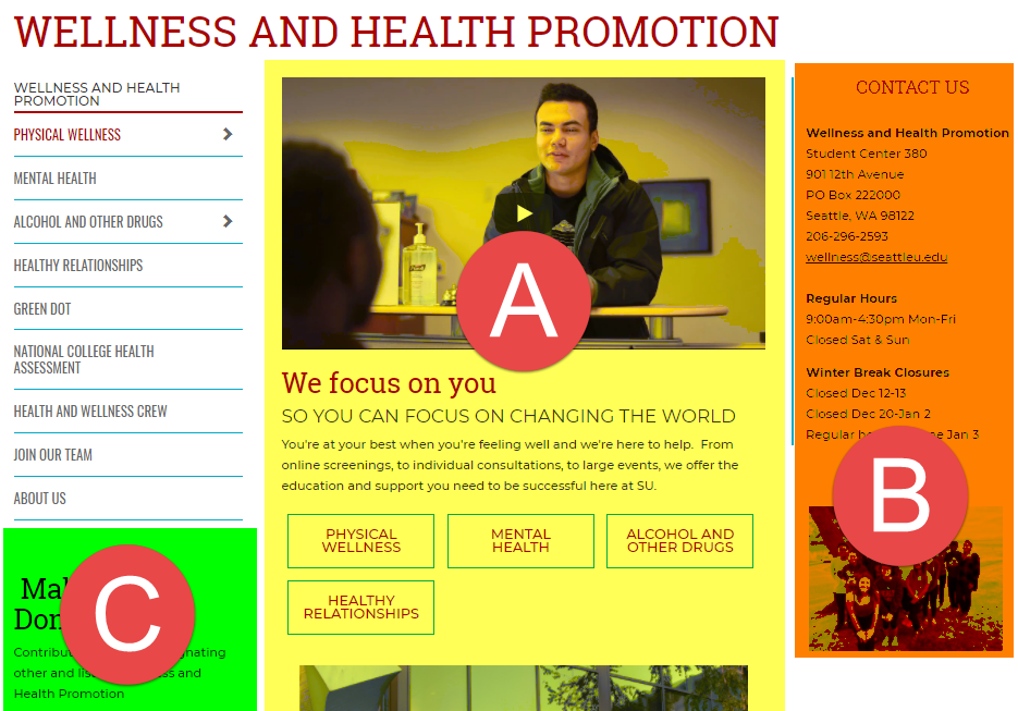
Our page layouts include several different zones where you can add content on your page. This is where you will find Zones A, B, and C on a standard subpage template:

Page Layout Options
We have six different page layout options:
| Page Layout | Top Zone | Zone A | Zone B | Zone C & Section Navigation | Breadcrumbs | Page Title | Section Banner |
|---|---|---|---|---|---|---|---|
| Homepage | x | x | x | ||||
| Homepage with Breadcrumbs | x | x | x | x | |||
| Landing Page | x | x | x | x | x | ||
| Landing Page without Breadcrumbs | x | x | x | x | |||
| Standard Subpage | x | x | x | x | x | x | |
| Standard Subpage without Page Title | x | x | x | x | x |
To change a section's page layout, select the section you'd like to update in the Site Structure.
Changing Page Layouts
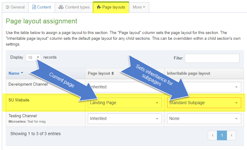
Once you have clicked on the section, select the Page Layouts tab.
In the "SU Website" row, in the first column ("Page layout"), you will use the drop-down menu to select a page layout for the current section.
In the second column ("Inheritable page layout"), you will select a page layout that will be inherited by any subpages.
You should ignore other rows except "SU Website." The other rows refer to channels only available to administrators for testing purposes.

Then be sure to Save Changes.
Banners
All Seattle U web pages must have a banner, and we currently have three banner options which vary depending on the page layout.
If you are using a "Homepage" or "Landing Page" page layout, then you can add a large banner to the top of your page.
Currently, we have two different large banner types: Megabanners, and Title Banners.
Megabanner

Megabanners include:
- Title (red, all caps) in a white text box in the shape of a parallelogram, centered on top of the background image
- Background image
- Color overlay (optional)
- Two colored triangles on the top left and bottom right corners
- Small arrow running behind the title, on top of background image pointing down toward subtitle/paragraph
- Optional Subtitle (red, all caps) and paragraph of text beneath the banner image
Title Banner

Title banners include:
- Heading (red, all caps) in a white text box below the banner image
- The optional smaller subheading for the "parent" section on top of the heading (black, all caps)
- Background image
- Color overlay (optional)
- Two colored triangles on the top left and bottom right corners
If you would like assistance to add a Megabanner or Title Banner to your page, please contact web@seattleu.edu first for guidance and permissions.
Section Banners

If you are using the Standard subpage layout, then any content editor can update and change their section banners through the Section customizations subfolder.
Content editors can change these elements of the section banners:
- Banner Photo
- Section Banner Title (in the example above: Theatre; red, all caps)
- Parent section text (in the example above: College of Arts and Sciences; black, all caps)
- The color of the border line to the left of the banner photo
You can find more detailed instructions on how to customize your section banner in the How To section of this website.