Card
Description
The "Card" content type creates between 2 and 4 "cards" in a row. A "card" consistents of a small image above a short heading, a short amount of text, followed by a link.
Available in zones:
- Zone A
Permissions:
- Available to all content editors
When to use it
The card content type is a great one to use when you want to use images while facilitating navigation to other pages.
How to use it
Navigate to the section where you wish to add the card content item. Click "Create content" then select the "Card" content type.

Required fields
- Name
- The text in this field is for internal, informational purposes only, and appears in the list of 'content in this section.'
- Heading 1, 2
- The text in this field displays as an H3 heading in larger red text beneath the image (or at the top of the card when no image is present)
- Link 1, 2
- This link must be a section or content link
- The link will appear below the text with a small red-orange arrow tree pointing right
- The link text defaults to showing the name of the section or content item you are linking to
- If you wish to override this default, uncheck the box that says "use default link text" and a field labeled "Enter custom link text" will appear and you can add your custom link text, such as "Learn more" or "Apply now"
Optional fields
- Image 1
- The image in this field displays at the top of Card 1
- In this field, you will select an image from your computer to add directly to this content type. This image field is a "direct add" rather than a "media library" image field
- The "alt description" for accessibility is automatically generated the template and will be "image for" and then the heading associated with this card
- Make sure that your image has been cropped, resized and optimized for the web before adding it to this content type.
- Minimum recommended image size: 600x300 pixels
- Text 1
- The text in this field displays using normal, black paragraph text beneath the heading, above the link
- Image 2
- Text 2
- Image 3, 4
- Heading 3, 4
- Text 3, 4
- Link 3, 4
Additional things to consider
Need more than one row of cards?
If you need more than one row of cards, then you can stack multiple card content types in a section.
Responsive design
When your users view your page at mobile sizes (767px or smaller), the cards will all stack in one long column instead of in one row horizontally.
Selecting a good image
- Consistent image sizing is key
- It's best if all of the images are cropped/resized to be the same dimensions (height and width) in pixels
- Minimum recommended image size: 600x300 pixels
- Test in preview to make sure your cards look good at both mobile sizes and desktop sizes
- Optimize your image for the web to increase load speed
Permission and Copyright law
Did you create these images? Are these images copyright protected? Do you have permission to use these images?
All web content must comply with the Seattle University Copyright Policy. Text, images and videos, and other media files, that do not meet these requirements must be deleted immediately.
In cases where copyrighted material is posted with the permission of the content owner, that permission must be attained in writing and be available for verification if needed.
Examples

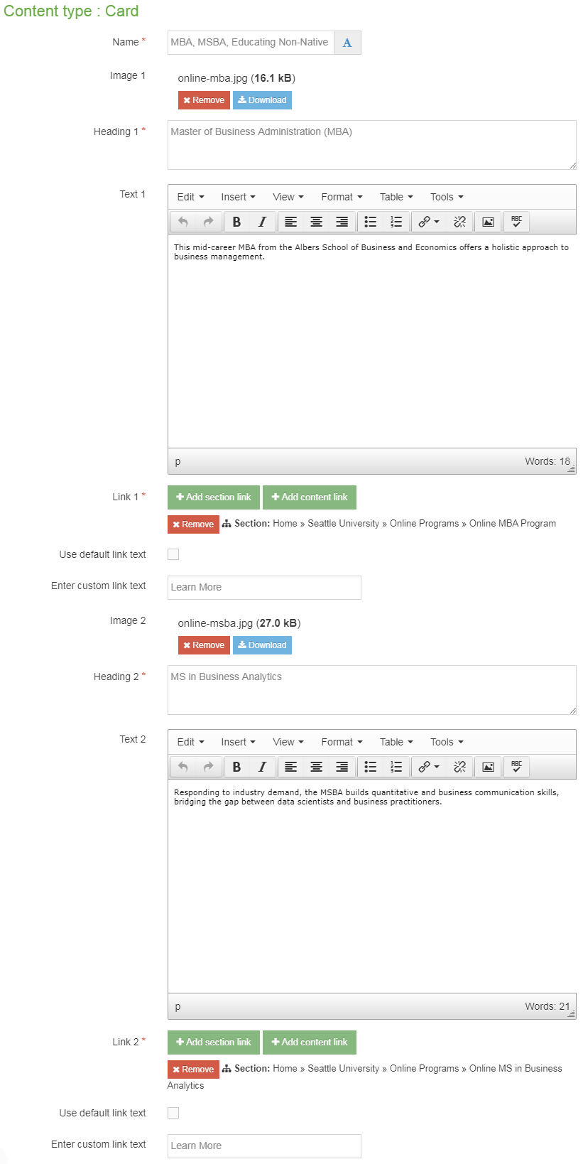
Master of Business Administration (MBA)
This mid-career MBA from the Albers School of Business and Economics offers a holistic approach to business management.

MS in Business Analytics
Responding to industry demand, the MSBA builds quantitative and business communication skills, bridging the gap between data scientists and business practitioners.

MA in Educating Non-Native English Speakers
These College of Education offerings support professional educators with skills and knowledge for language acquisition and learning for K-12 students.